


Here, you can choose and mix different customizing options into a unique map totally tailored for your business needs.
The default mapping territory is China’s geographic boundary. You can change the territory totally as your wish, such as: For some types of natural gas projects, you can also choose territory outside of China. For example, tailor-made natural gas map can also consists of Russia, Central Asia, East Europe, Iran, Mynamar and Turkey etc. Maps for large-size LNG plants and LNG import terminals can consist the whole world. |
|
By default, there are countries and borders between them in the map. You can add administrative subdivisions of a country (province, prefecture, county) into your map. When you choose to add an administrative division, both borders of this division level and borders of all its higher levels will appear in your map. Here is some suggestions for choosing a right administrative division that can help to make your map look good: |
|
The default map background colors of its administrative divisions help to ensure that: However, you can also change the background colors as your wish (you need to provide detailed color parameters). Background color change is more used for special purposes. For example, you can read a region’s economy level via defined colors used for different administrative divisions. By this way, you also can read whether or not a region’s local government has signed its city gas franchise contract. Please refer to “add regional economy info” in the left menu. |
|
Regional GDP (province, prefecture, county) can be reflected in the tailor-made map by defined colors for each administrative division. This customizing option can help plant or pipeline investors to plan their site or route by regional economy situations. Other business parameters can also be reflected in this way. For example, a city gas investor can learn whether or not a region’s local government has signed its city gas franchise contract. Refined oil wholesale company can learn different regions’ oil consumption level. |
|
In oil & gas maps, rivers and lakes are mainly used to reflect the locations for ship-based facilities such as oil storages, LNG reshipment terminals etc. To avoid visual interference caused by too many rivers and lakes, we suggest you only to add those most critical rivers and lakes into your tailor-made map. |
|
By default, there is no geographic location name in the tailor-made map. The reason is: automatedly exported names will, inevitably, overlap with other critical map elements, and that So far, the best way to add location names (administrative division, ocean, river, and lake etc) into a map without overlapis: by people. |
|
In tailor-made map, we use a set of tailored icons to represent different project types. The process of adding project icons includes two steps: First step, project location database is exported into the map. They are small dots used as reference points for adding project icons. Second step, the icons are added, one by one via people, onto the reference points. In this way, we can ensure: |
|
When tailor-making your map, you can choose to add names next to their associated projects. Plant or station project name is added next to its own project icons. Pipeline name is added, word by word, alongside the pipeline route. Each project name is carefully added to avoid overlapping with other mapping elements. |
|
You can choose to show a project’s commission status in the tailor-made map. For plant and station, we make it by assigning different colors to the same project icons. For pipeline project, we use solid line for commissioned pipeline and dotted line for planned pipeline. For all the recorded projects in your tailor-made map, we will provide a complete excel namelist with commission detail of each single project. |
|
Project’s parameters (such as designed production capacity, storage size etc) can be added into your tailor-made map. You can choose whether to add them near to the associated project icons, or to let them appear as a new column in the project list (referring to “Add project name list” in the left menu). Due to the limited mapping area, we don’t suggest to add too many parameters beside a project icon because it will lead to visual interference |
|
You can select specific projects for us to add their project introduction. You need to provide the content and ensure it is NOT against local law or social conventions. The introduction will be added near to its project icon and is carefully located to avoid overlapping with other mapping elements. |
|
Adding the recorded project namelist into a tailor-made map is one of the most used customizing options. It can let you know what and where those projects are by clearly organized tables. By default, a name list consists of two columns. One is the province name column and the other is project name column. Extra columns (such as project commission status, project parameters etc) can be added into the list for free when their associated customizing options are booked. For each map, the room available for adding project name list is limited, about 300 projects per square meter. |
|
You can nominate projects for us to highlight in your tailor-made map. These projects can be enlarged, specially colored or represented with uniquely drawed icons. For pipeline projects, we can assign special color to all the pipelines within your nominated area (such as a province, an oil field, or a single pipeline) so that they will look totally different from pipelines elsewhere. |
|
When tailor-making oil and gas maps, we can help you to filter out and highlight specific projects that meet your interest. The filter is based on a couple of conditions such as project size and main stakeholders etc. Examples: |
|
The supply radius is one of the most important considerations when planning projects such as LNG plants, LNG import terminals, CNG mother stations and oil storages. You can choose to add the supply radius for nominated projects in your tailor-made map. The supply radius is formed by a couple of concentric circles with your nominated project site as the center. The distances between these concentric circles are equal and represent your nominated distance (km). Competitors and downstream users are often added into a map with supply radius. This is to reflect the competition and market situation for the area within the supply radius. |
|
Driving routes and associated distances can be added into a tailor-made map. In most cases, the driving route’s starting point is your project site (such as LNG plant, LNG import terminal, CNG mother station and oil storage etc), and the destination is your user’s downstream consumption facility. We don’t suggest to add driving routes into oil and gas pipeline maps since it will cause visual interference. |
|
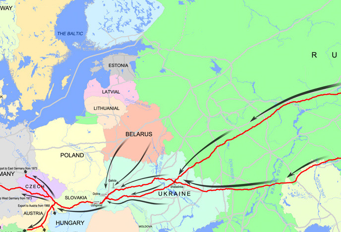
For oil & gas pipeline maps, arrows can be added alongside selected pipelines to represent flow direction of the oil or gas. |
|
You can choose to add scale and legend into your tailor-made map. |
|
By amplifying selected area, we can add more projects (icons and names) into your tailor-made map. |
|
We can add your company’s name, logo and introduction into your tailor-made map. This is to make the map play an extra role to promote your company. |
|